You might use images that contain text to create visual interest, organize information, or achieve a certain style in your design. However, using text as images can make your design less accessible.
How do images fit into accessible design?
Images of text can create barriers for people who rely on assistive technologies such as screen readers. These tools can only interpret actual text characters — not text embedded within images.
For example, consider this image of a brochure:
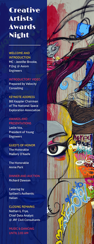
The background of the brochure is covered in graffiti-style drawings that include words and letters. The words and letters that are part of the background visuals are not essential to understanding the design, and don't need to be read by a screen reader.
However, the image also features text in the left column, with the event title "Creative Artists Awards Night" and, below it, details of an event that a screen reader cannot read, unless it is transcribed and included in the alt text.
Text vs. Images of Text
| Text | Images of Text |
|---|---|
| Editable and selectable in the Venngage Editor | Appears as part of an image and cannot be edited |
| Readable by screen readers | Not readable by assistive technologies |
| Can be styled using fonts, colors, and formatting tools | Must be replaced or described with alt text |
| Scales clearly and remains sharp in any size | May become blurry or distorted when resized |
👉 Using real text ensures your content is accessible, searchable, and visually consistent across devices.
How to ensure your images are accessible
The easiest and most effective solution is to use text instead of images of text whenever possible.
To add and style text in Venngage:
-
Click Text from the left sidebar in the Editor.
-
Choose a text type (title, subtitle, or body text).
-
Use the bounding box to move or resize your text on the canvas.
-
Customize your text using the top toolbar, which includes:
Color picker
Font face and size menus
Bold, italic, and underline styles
Alignment options
Line height and spacing
Bullet or numbered lists
Hyperlink tool
Text Tag (for tagging headers and adding alt text)
-
Effects, Layers, Align, Group, Lock/Unlock, Duplicate, and Delete
If you must use an image of text
If replacing the image isn’t possible (for example, in a logo or decorative element), add alt text to describe the image and include the same text that appears visually.
If the text is purely decorative or part of branding, indicate this in the alt text to help assistive technologies skip nonessential content.

Curious about upgrading? Compare our plan features side by side.